Sunday, 1 September 2013

Pop Art goes Design

Welcome to my new collection 'Pop Art goes Design' - with my subject: 'The Camera'!

Below is a bit of background on what I have been working on these last few months in preparation to launching my new everyday collection @ Maison this September. 

My approach to 'Pop Art goes Design' was through the eyes of POP ART from the 60's – an era when artistic impulse and experimentation began to take hold of the art community – so I approached this collection very much with an open mind, experimentation being key, and a desire to play with paint, paper and photography and screen printing.


' Camera Portraits'

As a starting point I wanted to capture vintage analogue cameras in their raw beauty as the wonderful crafted objects that they are, aware that they are about to become extinct in our fast track digital age ... - ironically these were photographed on my (now considered old but not yet vintage) Nikon D300 with my favourite 60mm Micro Nikkor 1:2.8 D lens.


 'Camera Groupshot'

One of my main influences was Joe Tilson, with his wonderful mix of photography, news print, graphics and paint.


'Cut Out and Send' Joe Tilson 1968


The two designs below will launch in stationery products in early 2014
'Pop Art goes Design Model III '


 'Pop Art goes Design - Click Print and Paint'

Richard Hamilton was another great source of inspiration for me - there is a quality to his work which I find captivating - the space around his pieces speaks to me and holds my attention just as much as the paint and collage.


'Study for a Fashion Plate' 1969 Richard Hamilton.

Here is another design of my collection.

'Pop Art goes Design - Cut out Camera'

'Look' by Joe Tilson

I love this piece as it reminds me of how I have tended to draw and 'LOOK' at things when I was a child - close up - attention to the graphic detail of things - bold and strong. 

My childhood in the early 80's was spent busily drawing with 'Rotring technical pens' in varying thicknesses, which is in part the inspiration behind my 'Pop Art Circles' design (pictured below), along with old graphics from that era, with an echo of pop music and the camera lens in mind ... and a nod to Lichtenstein's 'Dots' after visiting the Tate this year :-)


'Pop Art Circles': cushion screen printed cotton with neon piping.
Wanting to bring the design into the 'NOW'! I instinctively added the neon accents on the cushion pictured above – neon is present in our everyday lives, both on our bikes and safety wear, and in our fashion with an emphasis on standing out. 


I then continued to play and added the classic Brownie Camera; the coloured filter lenses help form abstract circles for what became the signature design of the 'Pop art goes Design' collection (pictured below) that features on stationery and notebooks.


 'Pop Art goes Design' - Notebook cover design


Hard back Notebook and Sketch books available from mid September here!

'Pop Dots Art' close of up A5 Sketch book

Designing 'Pop Dots Art' was fun as my team & I playfully collected hole punch colours, letters and graphics in order to form an off beat pattern and spell out the words of this collection!

As I mentioned at the top, when I was designing my new collection I wanted to include playing with screen printing as this creates a special feel that is very different from the digital printing we usually do today, so all the fabrics of my collection are screen printed. 


'Camera Stack': Screen printed Tea towel 100% Linen

I hope you enjoyed this little background story about what I have been up to with my team over the last few months, and I look forward to seeing you over this next 'month of Design' both here (in London) and in Paris from the 6th- 10th September.

Bon Jour!

Ella Doran.
Special thanks go out to:
Kaja, Jess, Anne-Sophie, Debbie, Asa and Joelle, for all your support on this collection.

Friday, 12 July 2013

Leandro Erlich: Dalston House!


If you have not been already and you are in, or coming to London, do go to this, it's wonderful! 
Be prepared to queue - and have a plan as you only get 5 minutes to be in the picture! The best interactive art piece I have encountered all year. 
 Dalston House by Leandro Erlich.
have a fab weekend in the sunshine everyone!
 

Sunday, 16 June 2013

Rugs Competition

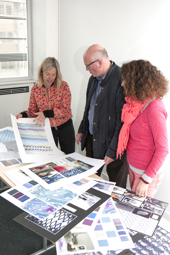
I was invited to judge on this years Good Weave Student competition, with Katrina Burroughs known best for her 'How to Spend it' for the FT and Roger Oates, Paul Vowles from Woven Ground and Lucy and David from Jacaranda carpets. 


GoodWeave UK runs the annual Student Rug Design Competition to
encourage young designers to consider the importance of ethical
manufacture from the very start of their careers, highlighting GoodWeave’s work to end exploitative child labour in the rug industry. This year’s competition was co-sponsored by Jacaranda Carpets and WovenGround.

Paul and Roger deliberating.......

Working to a brief set by Roger Oates, students were asked to interpret fashion in order to design an elegant rug with a luxury feel. Charlotte took inspiration from the techniques used by Jonathan Saunders in his Ombré Collection and her research into colour blending, starling murmurations and reflections of sunlight on water led to her final design.

The  Competition has been won by Charlotte Wildsmith, a second year Textile Design student at De Montfort University, with her striking design below:


Charlotte’s design wooed us all!
I particularly was drawn to the colour range of Charlotte’s design as I found it striking, original and at the same time unusual. I can see it working in multiple settings with its eclectic colour and I’m very much looking forward to seeing how it translates into a rug!
Here are some other pieces which stood out for me from the student's work.....


I particularly loved this print below, which was in the student's back up material, and was not her final design. I loved this and would frame it and have it on my wall!  Sometimes it is about knowing when to stop with a design ... in this case less is more.


an example below of the type of boards and back up work that we received....

This was a strong contender - one can really imagine this as a completed  rug


Lucy and David checking the names of our shortlist.....


I loved this design which was again a lead up design to the final  piece, which in my view was stronger, I would love to see these subtle rainbow colours on grey, like oil on water....


Congratulations to all the entrants - and if you are a student reading this, be sure to check Good Weaves website for their next competition!


Wednesday, 29 May 2013

Clerkenwell Design Week 2013

Last week I had the pleasure of being a visitor to the Clerkenwell Design Week - (and not an exhibitor) I was joined by Paul Vowles from WovenGround, as we had both been judges at The Good Weave Rug competition that morning in the City. (I shall blog about that next week sometime, once the winner has been announced !!) so below I have added a few of my favourite things from my visit......


above and below are some close ups of Lubna Chowdhary's beautiful ceramic table tops, which were created after a conversation with Domus Tiles the manufacturers of the tops.


We then headed to the Farmiloe building where my favourite pieces were the lights .....


in glass and ceramics......


these lights were by Hand & Eye Studio .... lovely!


I dont know the name of these glass pendants, the colours were exquisite, so if anyone knows the designer and maker please let me know?


and the wonderful office rooms in the Farmiloe building, where I felt my wallet itch a bit!!! I found these beautiful earn like vessels that have been designed by Gone Rural for Shake The Dust. Combining waste fabrics from local textiles & sweet wrappers with the artisans’ native lutindzi grass & sisal fibre. I without doubt want 2 or 3 of them!


We then headed towards the House of Detention 
and these chairs designed by Assemble  were decorating the streets - the chairs are triangular and tessellating (and comfortable)- they can be stacked and reconfigured to make wonderful seating arrangements, for play, performance and of course....rest!


'sitting close' - triangles from triangles 


I think this little 'pop up' garden centre was created by some local school kids....


happy growing.... 


These cork based tetra sheds'  were in the garden's at St James's church... I particularly loved the one with the rug in, a nice small space for reading, yoga or photography as the natural light was excellent with the white walls and skylight top. 


this beautiful hand embroidered rug (by Arraiolo - made in Portugal) was in one of the Tetra sheds- beautiful colours, and of course all things geo grab my eye :-)


Monday, 6 May 2013

Vital Arts Printathon and Peepshow for the Royal London Hospital 2013!

Rainbow Flowers a series of 5 prints.

A sneak peak before they go off to the charity Vital Arts


These images were taken about 10 years ago now for a project that my glass designer friend Amy Cushing and I were working on at the time.
 
I have donated them to the charity Vital Arts for their printathon 2013 - to help uplift and brighten some hospital waiting and treatment rooms....

In their words:


Selected prints will be featured in an exhibition at the Royal London Hospital Vital Arts Gallery in Whitechapel and will then be installed for permanent display in consulting and treatment rooms for children attending appointments at the hospital. Artwork makes an enormous difference to children facing the stressful and frightening experience of attending hospital and it's a great chance for a huge audience to directly benefit from your work.

Vital Arts are doing great work in commissioning many artists and designers to enhance and lend their creative imagination to the Royal London Hospital in all areas, from the wards, to the halls and waiting areas, it's a treasure trove to behold!
 
happy bank holiday everyone ;-)